Okay, we all know that today people who go to the actual store are a dying breed. In this digitalized world almost every business is done online. That means that the success of your business largely depends on the design of your website. The design has been evolving over the course of years as the online competition was growing bigger until it reached today’s vast proportions. So you had to invest a lot of time and money to engage your visitors, making videos, drawings, animation, and high-quality written content in order to fully explain the benefits of your services and products. But the sad truth is that all that doesn’t fully guarantee anything.
That’s why every good web design agency is known for using the creativity of their professionals to focus on conversions. This is the point when visitors actually become customers. And in order to get that job done, you’re gonna need outstanding CTA (Call-To-Action) buttons. If you have any doubts about the importance of this element just keep in mind that this is the place where one click can seal the deal. But every click is increasingly hard to get, especially the one that presents the final decision. That’s why we’ve prepared some CTA buttons design tips that will make your potential customers an offer they can’t refuse.
1. Roses are red, violets are blue
Okay, we’ll start with the obvious one – the colors. Even if you’re completely unfamiliar with psychology you have to admit that you make a lot of choices based only on the color. That is because every color has a different kind of emotional impact on us and you can use this psychology to reach higher conversions. But still, this doesn’t mean that there is some simple recipe on how to choose an ideal color for your CTA buttons. You would think that green means ‛go’ and red means ‛stop’ but there are tests that have proved that wrong.
So you’ll have to dive beyond the simple semaphore logic in order to harvest all the psychological benefits. But that still can’t be one hundred percent accurate since there are always exceptions in behavioral patterns. That’s why one of the safest ways to go is to pick a color that really stands out.
Naturally, you should ditch the whites and grays, but be careful not to go in the opposite extreme. The tone needs to be striking. But it shouldn’t be like a poke in the eye, which makes fluorescent and neon colors also a big no-no. The point is to make the contrast considering your whole landing page. In other words, the color of your CTA buttons doesn’t have to be wild & crazy, it simply needs to stand out from the background but it still needs to be a part of the overall design.

2. To be or not to be?
Finding the right color becomes pretty useless if your CTA buttons end up looking like the elements of a rainbow. They can stand out all right, but if our brain is put in front more than two options we have difficulty in reaching a decision. In most cases, our brain just freezes and we end up not making a choice at all. If the users have come this far that means that they are already engaged and interested. So there’s no need for ‛the more the merrier’ routine when it comes to your CTA buttons.

We know how bad you want that conversion. But plastering your landing page with numerous CTA buttons will produce quite the opposite effect. The point is to make the choice very simple. So for a shorter landing page, one CTA button will be quite enough. For a longer one, we would recommend just two because that will rid the users of the decision fatigue and make it easier to click on one of them.
3. No obligations
Even when you get the color right and the choice simple, there’s always a question what to write on the button. Writing copy for CTA buttons can be quite complicated since it needs to be short and effective at the same time. It takes a little creativity, but it also requires some caution. People are reluctant to click on a button that suggests they’ll be obliged to do something, so keep away from the friction words – they’re not welcome on your landing page.

People are reluctant to give you their money, energy, or time, so don’t mention words such as Give, Donate, Buy, Sponsor, Submit, Sign up, etc. Instead, you should use words that indicate users will get something without obligations so a simple Get, Discover, or Learn would be perfect. If these don’t fit in your offers try going with neutral ones such as share, visit, join, start, etc. Sometimes the simplest solution could be the best one.

4. Yours truly, CTA buttons
Yes, simplicity is always the best way to go, but that doesn’t mean you should simply put a CTA button that says ‛click here’. Every business is a human interaction at its core and users need to feel that there are some flesh and bone behind all that design. That’s why you need to make your buttons personal and they need to represent your product.
Generic words like download or submit sound too much like a mindless machine and they’re a pretty big turn-off. But if you add some unique word your brand will immediately gain an identity. For example, GWM, a web development company, is using the phrase ‛talk to an expert’ which will definitely get more conversions than a simple ‛contact’ due to the human factor behind it. The point is to make them feel you’re at their service personally.
5. This is the place
And, in the end, your CTA button needs to be clickable. This might sound obvious, but we’ve seen too many buttons that don’t indicate they could be clicked on. The color we mentioned at the beginning helps a lot to make the button stands out. But also, the shape and the border are equally important. It’s recommendable to make them curvy because round corners will draw the users’ attention to the center of the button. You can also experiment with other shapes like triangles or circles, but don’t overdo it. And don’t forget the white space around it – the background is also an element of its design.
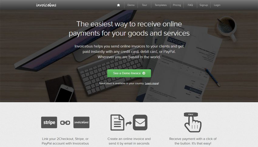
Take for example the Invoicebus homepage, the simple text explanation and the green CTA button with round corners. It stands out so the visitors can have clear action in mind. Also, it doesn’t push the users to sign-up or buy the service. Rather, to see how a demo of an online invoice looks like.
Conclusion
With all this said, keep in mind you can use CTA buttons not only for email blasts or PPC campaigns but also for many other types of marketing. You can use Instagram posts to entice people to check out the link in bio, create a blog post and encourage readers to comment, Facebook posts where people can ‘learn more’, etc. All you need to do is go through your content and figure out where you can incorporate CTA, easy peasy.

Latest posts by Chloe Smith (see all)
- 5 Top Design Tips to Create Outstanding CTA Buttons - June 20, 2018

